CITY CYCLES
Website Redesign

Project Overview
City Cycles is a Portland, Oregon bike shop that offers short-term rentals to locals and visitors looking to move around town on bike. They are a growing business that has been struggling to get users to make reservations online.
The owners of City Cycles hired me to assess user experiences on their existing site to uncover what might be preventing users from completing online reservations and use that data to redesign their website to be more functional.
Project Role & Scope
Problem
Project Goals
For this project, I was the lead UI designer and UX researcher charged with completing:
-
User Research (both qualitative and quantitative)
-
Wireframing
-
Refining Visual Design (color, type, logo)
-
Prototyping
-
Conducting user testing and incorporating revisions
-
Presenting to project stakeholders
-
Packaging for Handoff
How do we create an enjoyable online bike reservation system for our clients?
Clients frequently call the store to make reservations which has made it difficult to help people shopping in the brick-and-mortar shop. The business is trying to understand how they might get more potential cycle renters to reserve cycles on the City Cycles website.
-
Conduct Usability Testing to evaluate user experience on existing website to understand pain points
-
Clarify an unsuccessful existing website.
-
Build out an easy-to-use online reservation system.
Tools
-
Google Analytics
-
Miro
-
Adobe Photoshop
-
Adobe Illustrator
-
Figma
-
Protopie
Team
-
UX/UI Designer
-
Owners
-
City Cycles Clients/Users
Timeline
-
2 weeks: Preliminary UX research
-
3 weeks: Designing & Testing
-
1 week: Refinement and Hand-off
Design Process
01.
Research
02.
Sketching &
Wireframing
03.
UI Design
04.
Prototyping &
User Testing
05.
Refinement & Hand-off
Research
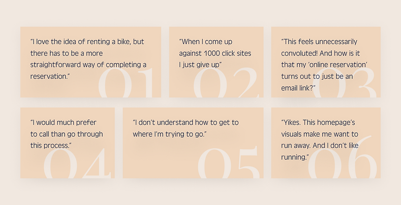
Throughout the design process I employed a range of data gathering techniques, both qualitative and quantitative. In order to understand what was and was not working in the existing website, I completed real-time user observations. These confirmed some assumptions I had about website functionality, but also added nuance that I hadn't previously considered.
From this research we were able to articulate the following pain points:
-
Website organization is unclear
-
Information is not located in expected places
-
“Online” reservation system requires too many clicks and ultimately leads to an email pop-up (no reservation system even exists online)
-
Users call the store because they have become frustrated by the online set-up.
User Persona

Developing a user persona allowed us to make choices that were attached to a “real” person rather than to abstract ideas or general assumptions.

User Flow
Examining how users interacted with the existing site structure offered insights into pain points and highlighted opportunities for improvements.
Offering users opportunities to share thoughts openly provided trust in the process, built brand loyalty, and created more authentic solutions.
User Interviews

Connecting user thoughts, feelings, words, and actions helped unearth assumptions frequent users were making about what was/was not working with the existing site uncovered nuances in users' behaviors.
Empathy Map
Sketching/Wireframing
Begining with low-fi Idea Development, I worked through wireframes that incorporated user feedback to meet the owners’ goal of encouraging more users to reserve bikes online rather than in-store or over the phone. I began this process mobile-first to test proof of concept and then moved to desktop design after I received feedback that most City Cyles renters wanted to use larger devices to reserve bikes.
Adding consistent navigation and a highly visible reservation button at the top of the home page was a way to encourage visitors to reserve online and make that experience a pleasant one.
Simplifying the relationship between text graphics on the homepage also helped meet the owners’ goals.
Sketching

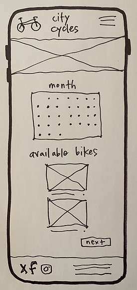

Digital Wireframing
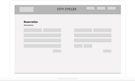
After making several refinements, I used Figma to create digital wireframes of several key pages in the reservation process. I shared these wireframes with a handful of users to get initial feedback, which I then reviewed and used to adjust the wireframes.
Preliminary Wireframes for City Cycles reservation sequence.
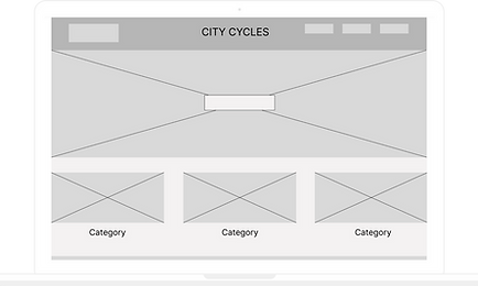
Home Page
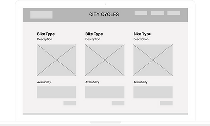
Bike Selection Page
Payment Page

Confirmation Page
Look & Feel
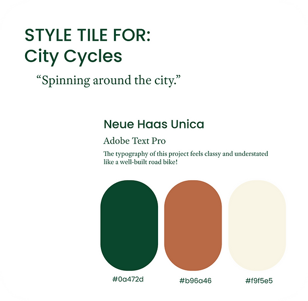
With basic layouts underway, I moved into the look and feel of the website. Not only was the existing website difficult to navigate, it was visually unappealing. The owners wanted to maintain connection to their original design while offering it some polish. City Cycles is known as a suave, reserved shop, quite different from its edgy and brash competitors. To draw on this appeal, I used a vintage British racing-inspired scheme and selected classic understated typefaces to use across the site.
UI Design
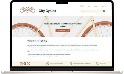
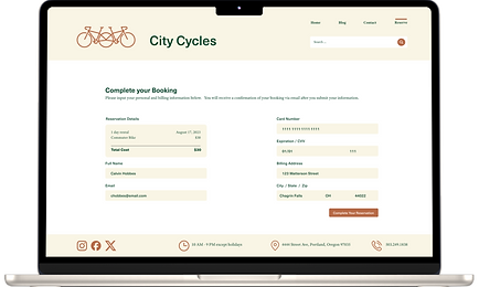
This site redesign offers clarified navigation, direct access to important site components such as the reservation system, and a sophisticated look and feel that is attractive to City Cycles' urban clientele.
Final Interactive UI Design for City Cycles Reservation Sequence.
You may also view this Figma prototype in a larger format if you wish.


Usability Testing
Once the look and feel had been established and applied to the prototype, I went through an additional round of user interviews via zoom which allowed me to record and review how users experienced the new design. Keeping this process short and focused was key to getting meaningful responses, which I then used to revise the site to make it even more user-centered.

Redesigned Site
Original Site Design
Next Steps
After the newly designed site is up and running, we will gather Google Analytics data and potentially complete A/B testing against a second version that allows users to prioritize bike type over date. The site design meets City Cycles’ goals as it stands, but some users indicated that they are more concerned with what they ride than when they ride, which isn’t reflected in the current design. If this alternative adds meaningfully to the site and if time and budget allows, we will incorporate it into the site.
Learnings
The most interesting takeaway or discovery from the City Cycles UX research process was that observing users as they interacted with the City Cycles site in real time offered a more nuanced understanding of how the site was (or was not) functioning.
As a result of conducting preliminary UX research, I learned that each method of data gathering provides additional layers of insight and clarity which, when overlain, help build stronger user-focused solutions.
Focusing on 1-2 functional goals in this design allowed us to create a strong user-focused site. Should the owners wish to add additional functionality in the future, the tidiness of this site’s architecture will make that a smooth process.