SITCONMIGO
Mobile-First Online Shop Design
Project Overview
Sitconmigo is a young furniture company focused on sustainable material use. Founded by designer Yolanda Lopez, the company is founded on the idea that what we buy reflects our values. Lopez’s values hinge on humanitarianism and intentionality and her business mirrors this.
Project Role & Scope
As primary designer, I was charged with developing a mobile-first website that allowed users to browse on any device. I was responsible for the full design process, from research through prototyping and, ultimately, product handoff.
Project Deliverables:
-
Design comps for mobile, tablet, and desktop devices
-
Color and Type design that is inspired by and bolsters the Sitconmigo line of products
-
Complete package of assets for hand-off to the development team.
Project Goals
Problem
Solutions
-
Showcase Sitconmigo’s chair designs
-
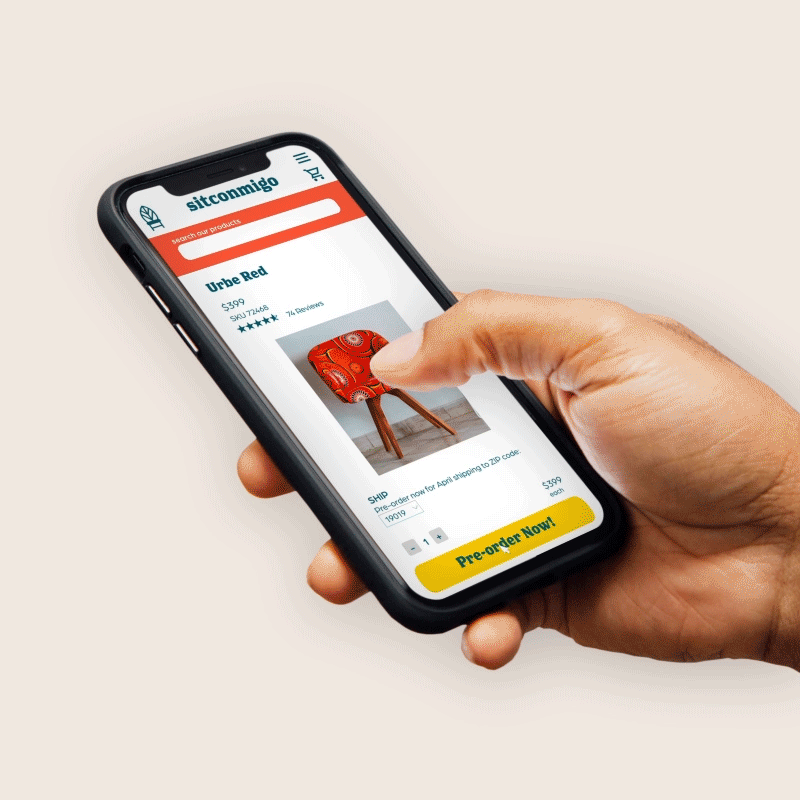
Highly visible calls-to-action encouraging site visitors to pre-order products
-
Emphasis on company personality and ethos shared through quotes, mission statement, and founder bio.
-
Clear navigation for Pre-orders, the About section, and Contact options
How will we make pre-ordering sustainably-produced furniture appealing and simple?
Sitconmigo’s owner wanted a site that shared her furniture designs’ vibrancy without taking away from them. In order to reach a wide audience, Sitconmigo needed a responsive site design that made it possible to pre order products through a clear, streamlined platform.
To encourage pre-orders (an increasingly important component of small businesses’ online sales) I created a central call-to-action button on the main page and on each product page.
The owner's focus on ethical manufacturing and purchasing was an important focus of the site, but we didn’t want that to feel heavy or burdensome. To meet these goals, I built a look and feel that was fresh and organic, but not overly playful or stodgy. We wanted buyers to feel invigorated by their purchases and their commitment to their ethical choices.
Tools
-
Figma
-
Adobe XD
-
Miro
-
Protopie
-
Artboard Studio
Team
-
UX/UI Designer
-
Owners
-
Marketing Team
Timeline
-
1 week: Research
-
3 weeks: Designing & User Testing
-
1 week: Refinement and Hand-off
Design Process
01.
Research
02.
Sketching &
Wireframing
03.
UI Design
04.
Prototyping
05.
Results/Next Steps
Research
Competitor/SWOT Analysis was the primary research completed for the Sitconmigo website. For this work I analyzed big-box and smaller-scale furniture retailers to understand their product diversity, how company mission was made visible in their content, and how they handled website layout and functionality.
Sitconmigo's owner also provided a list of mission-driven companies she admires to investigate for inspiration. To get a sense of how these companies' sites functioned I diagrammed out their user flows and looked for similarities that we might have wanted to incorporate into the Sitconmigo site.

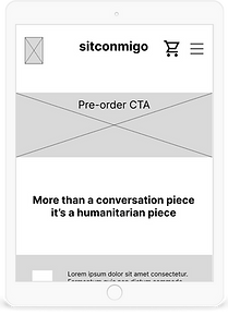
Sketching/Wireframing
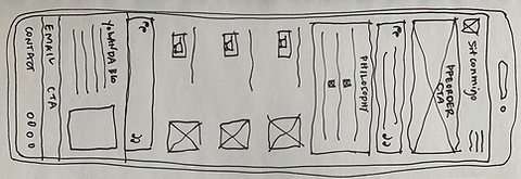
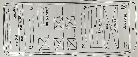
Sketching
Hand drawing allows for rapid iteration and prevents us from getting caught up in the details too early in the design process. Hand drawing in early design stages helps me start conversations with my team and/or clients and are accessible and flexible. These sketches are an exploration of the limitations and opportunities of each screen format.

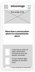
Digital
Once we better understood our goals I moved to Figma to refine the phone, tablet, and desktop designs with specific proportions. I walked through these designs with our stakeholders and made adjustments based on feedback before moving to high-fidelity designs. Some initial assumptions about scale, emphasis, design legibility weren't working once sketches became digital so there was quite a bit of tweaking that occurred at this stage (as there always seems to be)!

Color & Type
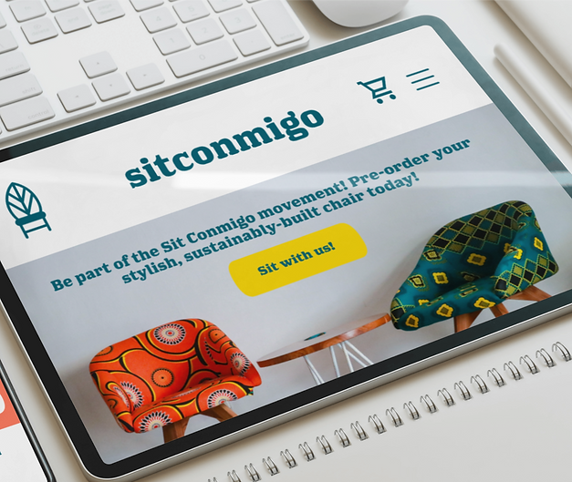
Sitconmigo’s products and founder are lively but sophisticated; a duality that I felt was important to match with type and color design. The vibrant red and yellow of the site are energized and eye-catching, refreshing difference from many eco-focused brands’ reserved aesthetics. An earlier iteration of this site's color scheme was a bit less punchy, which didn't seem to match the personality of the furniture or the shop's owner, leading to the current version you see here.
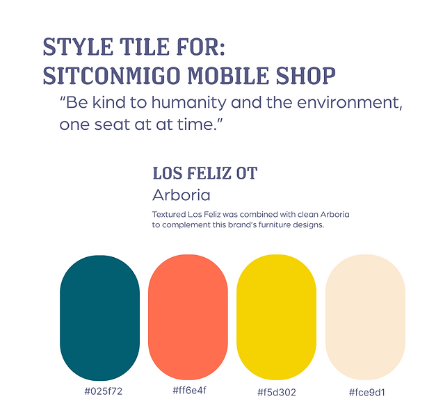
The logo and chair designs provided by the owner inspired both the colors and shapes that structure the site.

UI Design
Beginning with the homepage design for each device, I expanded the visual identity into the purchase sequence for the site.
For this stage I revisited the research phase of my work, turning a keener eye to online retail platforms and their ordering processes in order to maximize efficiency. We went through a range of iterations at this phase, testing more detailed and more streamlined versions of this shopping sequence.
Given Sitconmigo's currently fairly limited product line and sales history, we opted for a simpler checkout process. We can expand on this in the future if warranted.
Usability Features

User Flow for Shopping Sequence

UI Design for Sitconmigo Shopping Sequence.
You may also view this Figma prototype in a larger format if you wish.
Next Steps
Sitconmigo owner Yolanda Lopez is interested in building out site for future product launches in the coming months. Additionally, she would like to add functionality to the site that will help her business grow such as:
-
Incorporate mailing list opt-in to share and track product information
-
Track analytics data to track visits versus order completion
-
Incorporate human-interest stories relating to sourcing and production of Sitconmigo products to build consumer trust and buy-in.
Learnings
Given the level of competition that Sitconmigo faces in the furnishings market, research was a critical piece of this project through each phase of design, highlighting the nonlinear nature of UX/UI design. This research added depth to our iterative process and contributed meaningfully to the testing and feed-back loop that we used throughout the design process. Checking against this research helped anticipate consumer expectations and resolve design issues fluidly. While it is relatively the "easier" thing to bully forward without taking the time to pause and check project direction, it is almost never the "smarter" thing to do. We developed a far stronger product by incorporating this research and testing than we ever would have should we have forgone that piece of the work, highlighting the importance of UX research in design.
I had the pleasure of working closely with all team members and stakeholders on this project, which made my job as lead designer more challenging, but much richer than I could have expected walking into this project. Open communication and feedback during both research and design of this project helped both the project team and the end product develop depth. This project was truly a joy to develop.